Apple One logo redesign: What’s changing?
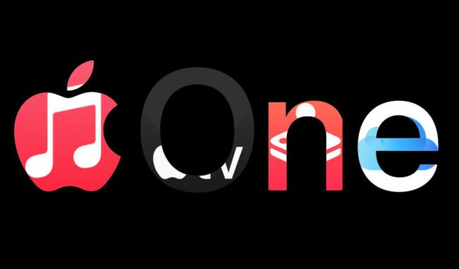
The Apple One logo is undergoing a visual transformation. Once a simple text-based or standard Apple logo treatment, the new design now shows the classic Apple silhouette divided into six colourful slices — each segment representing one of the core services in the Apple One Premier bundle.
The redesign was first spotted on the updated Apple TV website, rather than immediately on Apple One’s own landing page — indicating a phased rollout.
Visually, the new Apple One logo echoes the company’s nostalgic “rainbow” era logo, but with a more modern, stacked slice effect and richer colour differentiation to highlight the multiple services inside the bundle.
Why this Apple One logo change matters
Branding clarity
By giving Apple One a distinct logo, Apple is signalling that the bundle is its own entity — not simply a catch-all for services, but a branded product in its own right. The logo change helps make that intent clearer.
Visual representation of value
The six-segment design subtly communicates that Apple One isn’t just one service but several combined — including Apple Music, Apple TV, Apple Arcade, iCloud+, Apple Fitness+ and Apple News+ (in the Premier tier) — giving users a visual cue of the bundle’s breadth.
Market positioning
The timing of the update aligns with Apple’s broader services push and recent rebrands (for example, the renaming of Apple TV+ to Apple TV). A fresh logo for Apple One aligns with these strategic efforts to elevate services revenue.
The big takeaway
The Apple One logo change is a subtle but meaningful move. By introducing a colourful, multi-slice Apple icon, Apple is giving its bundled subscription offering its own brand identity that reflects the multiple services included. For current and prospective subscribers, the change signals that Apple One is evolving from a “bundle option” into a standalone, recognisable product.
What stays the same
While the logo has changed, there’s no indication that the core pricing or bundle structure of Apple One has been altered as of yet. The Individual, Family and Premier plans remain at the same levels for now.
What to expect next
- Roll-out across assets: The new Apple One logo is present on some pages (e.g., Apple TV site) but not yet fully on Apple One’s own webpage. Expect it to appear more widely in the coming weeks.
- Potential deeper service refresh: While the logo is the most visible change now, service refinements (such as interface updates, marketing messaging, or bundling tweaks) could follow — though nothing has been officially announced.
- Increased visibility: With a dedicated logo, Apple One may get more prominent positioning in Apple’s marketing and sales channels, reinforcing its identity as a compelling value bundle.
The big takeaway
The Apple One logo change is a subtle but meaningful move. By introducing a colourful, multi-slice Apple icon, Apple is giving its bundled subscription offering its own brand identity that reflects the multiple services included. For current and prospective subscribers, the change signals that Apple One is evolving from a “bundle option” into a standalone, recognisable product.